Brand Identity : Meet our Logo
The next step after creating a solid foundation of ConsciousLeap as an entity was giving ourselves a face. A logo that could hit the mark, one that could effortlessly communicate our raison d’etre. We went back to the design board but hit a dead end so many times. That’s when we met Jagrat and Aaron’s two budding talented designers; we struck gold with their razor-sharp attention-to-detail and minimalist, clean design ideas. In this guest post, Jagrat shares how they gave the symbol of infinity new meaning through ConsciousLeap.
My colleague and I were clarifying our design brief by asking questions about ConsciousLeap: what are its values, what does it stand for, how is it different from other self-help companies? Luckily, the answer was very clear. ConsciousLeap does not focus solely on rigid plans and frameworks that help you achieve your goals, nor does it solely aim to increase consciousness. It blends both ‘ consciousness to manifest material goals and taking feedback from our material reality to become more conscious. With this in mind, we set out to explore, and ultimately discover the most appropriate visual representation for this vision. Using keywords like Consciousness, Self-Awareness (Reflection), Flow, Growth, Material, we set out sketching and generating concepts for a visual identity. Upon some more understanding of the company and its products, especially the manifesting framework, we understood the emphasis given to constantly going back and forth between a person’s reality (material world) and their state of consciousness.
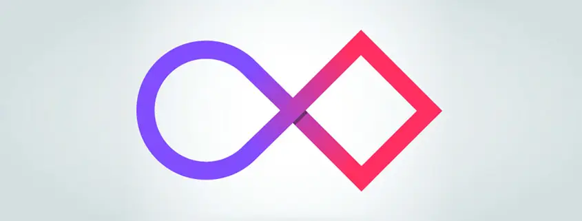
This idea of going back and forth constantly, an infinite number of times, led us to experiment with the instantly recognizable infinity symbol (‘) While the infinity symbol achieved various literal and figurative goals that we had set for the logo, we felt we still hadn’t captured ConsciousLeap’s unique approach of bringing consciousness and materiality hand-in-hand. Soon enough, we were pondering how we could visually represent and differentiate consciousness/infinite and the material world/reality. Our solution: The conscious/infinite is something that is indefinite, difficult to measure and subjective, while the material is definitive, easy to measure and objective. This led us to the idea of modifying the infinite symbol with a square on one side. Since squares have 90-degree angles and equal sides, it’s one of the most definitive and easy to measure shapes. Later, accidentally, we also realized that the shape naturally contained a ‘C’ and an ‘L’ for ConsciousLeap. Once the shape was finalized, it was time to select the colors. Red is the color of the material or Root Chakra in the Chakra system ‘ and also being associated worldwide to sensational elements ‘ naturally fit into the role of representing the material world.
To represent complete consciousness, we drew inspiration from the Crown Chakra and picked a color around violet that elegantly complimented the red. Since the main idea behind the logo is a constant change from conscious to material and back, a gradient turns the violet into the red and vice versa. The final result was this: Jagrat Desai is a user experience designer who loves technology. When he’s not following Man Utd. and English football he is either conceptualizing design solutions to everyday problems or looking for cool new gadgets. www.jagratdesai.com Twitter @jagratdesai Aaron Joseph is currently studying communication design, with a particularly keen interest in interface design. He is in the process of figuring out what the future of interface design will be and hopes to decode the role of designers in the near future. When he’s not overthinking he likes listening to hip-hop music. www.aaronjoseph.in


Leave a Reply
Want to join the discussion?Feel free to contribute!